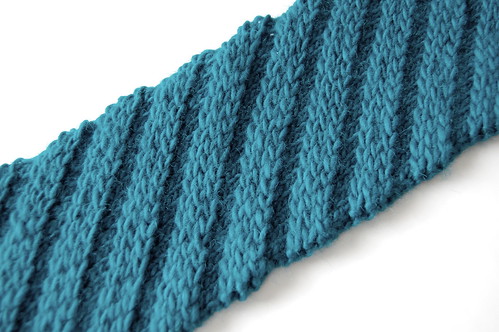
On that green. (Yeah, this one.)
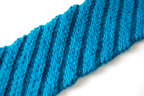
These are the last pictures I will take of that scarf, at least when trying to get the color correct:
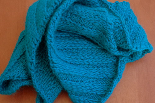
I think the first one is better. I think. But neither of them are correct, and the real color is kind of between the two. I feel a little bit better, though, 'cause the color on the website (scroll down to Aztec Turquoise) isn't right either.
So I wash my hands of this green!
But not without some fun tags on Flickr. My personal favorite is "stop overloading my green sensor you evil color".
Saturday, March 6, 2010
Saturday, January 9, 2010
A Step in the Right Direction
The color on that turquoise yarn is still vexing me. But I think I've figured out the first step in fixing it, which is correcting the saturation. I was reading about photographing intense reds (related to red yarn, of course, because that's apparently all I take pictures of anymore...) and they mentioned that since the camera has red, green, and blue color channels, if you overwhelm one of them, you can get less-than-ideal results. I think that's part of what's happening with this turquoise.
Here's an SOOC shot of the scarf-in-progress:
Ack! Color overload!
Here's a desaturated version of the same image:
Much better. The color tone is a lot truer, although it's still not completely accurate, and the brightness of the yarn is gone. I think my next try will be to take pictures of the scarf with a lot of other colors in the frame, to hopefully even things out. Cross your fingers!
Labels:
color,
saturation,
white balance
Subscribe to:
Posts (Atom)